
One on One: The New Uniforms
2017-08-16![]()
While the NBA is a year-round soap opera (especially in Cleveland), there is a brief mid-August lull in the news cycle to recalibrate the hot take cannon. It’s at this time that LeBron heads to Cedar Point for kids and coasters, and Zach Lowe visits Croatia to recharge his batteries for another year covering the thunderdome.
Carson Zagger and myself decided to go one-on-one to cover some non-Kyrie or Griffin news with a breakdown on the Cavs new jerseys. Join us below in the comments section to offer your takes on the new duds, and what you would have liked to have seen instead.
Cory: Now that you’ve had a week to digest the Cavs new Nike jerseys, what are your thoughts?
Carson: Insert “splendiferous barfing cup” clip here. Honestly though, is there a reason Cleveland teams are constantly being punished with horrible new jersey designs? First the Browns took one the most classic looks in sports and added ORANGE!!! retina burning highlights and stylings that made them look like mediocre high school uniforms. At least the brown wasn’t changed to British khaki or something.
Now the Cavaliers jerseys are suffering a similar fate. Gone are the now-iconic (in Cleveland, at least) unis, that the team, ya know, wore winning the their only championship ever. The Cavs’ mustardy gold and royal wine uniforms were sleek and universally well received. They were symbolic of the LeBron 2.0 era, the most successful in Cavs history, and could have become a lasting part of Cavaliers lore. Heaven forbid if Cleveland strived for the continuity and nostalgia of the Los Angeleses, Bostons and Chicagos of the world.
I understand that changes were inevitable as the Nike wanted to make the jerseys their own. Even so, the new Cavs jerseys look like something designed for a cheesy sci-fi movie set in the far future where they play a game called “spaceketball” or something. They are trying too hard. The over-saturated colors and sharp, angular designs are harsh on the eyes.
Carson: How about you Cory? Hopefully you have a more positive view on them than I do.
Cory: We’d be a horrible pair for a segment on ESPN’s hot take afternoon argument block. I hate them. I’m jealous that Jaqen H’ghar didn’t take my eyesight before they were revealed. They are the worst possible conclusion that I could have imagined. They look like what Robert Zemeckis would have dreamed up in 1988 as futuristic basketball jerseys for Back to the Future II.
Carson: Ha. Glad we’re on the same page. What would you have gone with for the new jersey styles?
Cory: Well, I’m not holding this entirely on Nike. They’ve nicely added to the NBA wardrobe with their overhauls of the Clippers, Pacers and Suns uniforms, with the Pacers being my personal favorite. The disappointment for me is that there’s so many possibilities the Cavs could have gone with that would have been a winner.
You made a good point in your opening that the Cavs have never tried to forge a lasting identity with their jersey branding. They’ve had TEN major overhauls of their uniforms in 47 seasons, and most of them could have been subtly modernized to become a J.R. Swish heat check show stopper rather than The Jetson’s/Medieval Times mashup we have now.
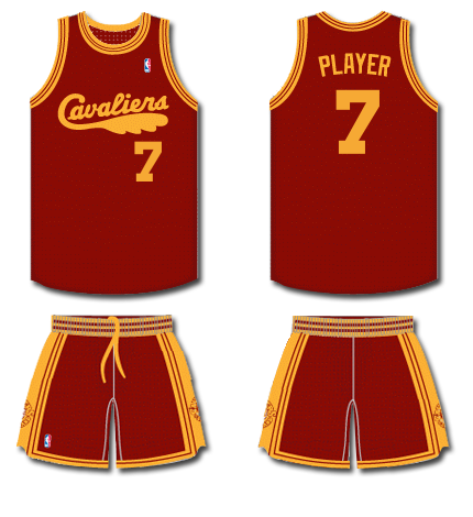
While I didn’t know years ahead of time how the plot mysteries of Lost would conclude during the final season, I had a guy feeling that the last frame would be on Jack’s eye, just as the show began. Why not have the Cavs jerseys tie back to their debut duds from the 1970-74 era. They were the franchises first threads, and I don’t think they’ve ever topped them. They were forged during the counterculture era that immediately followed the barrier breaking 60s, before fashion was destroyed during the boxy shoulder pady androgynous gakedout 80s. An update of the cursive script, short lengthening that wouldn’t get a girl sent to the principles office and perhaps a slight trimming augmentation is all that these would need to be one of the best of the new batch. Also, no other design imaginable would fit the Goodyear logo better than modernized feather fire.
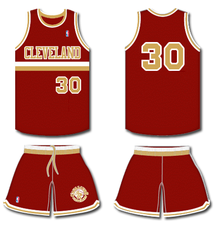
An update of the Cavs rarely seen 1980-83 jerseys would have been a surprise, but if done right, they could have been the Cavs version of the new Pacers uniforms. One of the primary reasons I hate the new uniforms is that they have too much going on, and while the new designs lettering looks good on a logo, it looks too Tennessee Titansy on threads.
I loved the Oklahoma City Thunders vertical alternate jerseys, and this would kind of play to that. A pair of stripes to separate the team name from the number would give it symmetry and balance. You’d have to update the lettering, and sleeken the stripes, but this one could have been a winner in the right graphic designers hands.
Or they could have just kept it relatively simple. This might be the best mashup the Cavs have thrown out there. A combination of the Cavs historic color scheme of wine and gold and the design from the Daugherty/Price era that got so many of us into hoops in the first place. I may be in the minority here, but these look better than the 80s threads that they were inspired by. I do prefer the previous red incarnation of this model that the team wore in 2009, but I can’t see the team dropping their wine for red any time in the foreseeable future.
Why not let a killer alternate jersey graduate from a featured player a full-fledged repertory cast member? A gold version with red lettering would be showstopper too. A page one rewrite of the shorts would be necessary as with most of these.
Carson: Just about anything other than what they went with would have been better.
Cory: The new jerseys are a fitting fabric interpretation of Iman Shumpert dribbling a ball off of his foot. So what are your thoughts on the sponsoring logos on jerseys this season?
Carson: It just annoys me on principle. Essentially, owners who’s teams’ values have grown exponentially are choosing to ugly up jersey designs that have existed for decades just to make a fast buck. I probably shouldn’t care as much as I do about it, but I hate the very idea of advertising on a jersey on an aesthetic level. No other US pro sports has ever done this. These are professional uniforms we’re talking about here and the logos look completely unprofessional—though small, the logos clutter what was the clean face of a jersey. And all of this comes just a couple years after the sleeved monstrosities.
The thing is, the Goodyear logo itself isn’t even that bad. It’s a cool winged foot and it’s been associated with Northeastern Ohio, but being placed opposite shoulder of the Nike ‘Swish.” is just too much. If it was one or the other I probably wouldn’t be all bent out of shape. That’s just the world we live in. Hey, at least we aren’t Kings fans with almonds on their jerseys.
Cory: Almonds are my favorite nut, so I will give them that. At least we finally have something we don’t completely agree on. I’m good with the logos. Sure the franchise values have skyrocketed, but the owners won’t see that profit until they sell the team. Gilbert gets more criticism than any other NBA owner, but spending has never been an issue for him. Gilbert lost $40 million during the 2015-16 season owning the Cavs. I’m good with the logo being there if it offsets his loses.
I too actually really like the logo itself. The colors matchup, and the symbolism of the winged foot of Mercury fits the game of basketball better than half of the teams actual logos. The Goodyear Wingfoot logo actually has a crazy long history history with NEO. It was developed in 1900! Hopefully that staying power will have an influence on the Cavs organization and they’ll get on the same page and find a proper jersey design and stick with it.
I get that there’s a little league kind of vibe with sponsored uniforms. Perhaps I don’t mind them because The Bad News Bears was my favorite movie as a child, and Chico’s Bail Bond’s on the back of a Bears jersey that I’d gladly wear until the stitches gave out. The film had such an influence on me that I quit little league after I found out that they wouldn’t give us beer.


http://www.nba.com/article/2017/07/31/teams-reveal-new-nba-nike-jerseys-2017-18 You look at all the other teams with new Uni’s… Cavs are basically the only ones with a radical change in both style and font/lettering. Almost everyone except the Bulls, Spurs, Lakers have a change in the general style (understandable given their uni consistency/franchise history). Mavericks, Jazz, Wizards, Pistons, Pelicans, Suns, Thunder all have a slight difference in style, but at least keep their fonts. Am I the only one thinking that Nike railroaded the Cavs into this big change to sell more merch in “LeBron’s last year in Cleveland”? Name me the last team to completely overhaul their… Read more »
NOT SURE IF WE WILL FIND OUT FOR SURE WHAT WAS SAID AT THE ” LEBRON / KY SUMMIT “—-POSSIBLY LEBRON INFORMED HIM AFTER THIS YEAR–” I AM GONE — YOU WILL BE THE MAN HERE IN CLEVELAND —BE PATIENT “—–AFTER ALLL ISN’T THAT WHAT KY WANTS —NOT REALLY LOOKING AT BEING ON A CHGAMPIONSHIP TEAM—JUST ” BEING THE MAN “
So the next story is what happened during The Meeting. We all wait.
Look like high school school jerseys to me. Dumb.
Enjoyed the piece, guys. I think the uniforms are trash. They just look dumb. And it’s not about the wing foot or the swoosh. Also abandoning the black a year after they won the first ship in 52 years in Cleveland? WTAF?
Thanks! There were a thousand possibilities that could have better than what they threw out there. Hopefully the alternates go over better. They played the 2016 Finals in a pair of alternate uniforms.
Heat is a good movie.
One of the best. All time great flick! So many story lines. Love Michael Mann films.
What else should Inwatch?
Michael Mann movies? Man hunter, Insider, Collateral, Ali.
He also did Blackhat which I really liked.
Collateral. I keep forgetting to see that. On my list.
Also Heat, The Miami Vice movie (awful), Last of the Mohicans (awesome), Black Hat (entertaining but stupid), Thief (James Caan as a jewel thief – early 80s), Public Enemies (Johnny Depp as dillinger), and the ultimate: The Keep (nazis versus golem).
I loved his TV shows: Crime story and Miami Vice. I wrote a thesis on him in college. He’s a fun, talented director but he can get in over his head. Colin Ferrell in Miami Vice doomed that film.
Yeah we mentioned Heat. Miami Heat the movie was pretty bad. I loved Blackhat. I went in not expecting much because of poor reviews and was surprised.
My problem with Blackhat (and every other hacker movie) is that it starts with a solid premise, and even some of the tech explanations are good, and then it devolves into a film that has nothing to do with hacking except “computers are magic.” By the end I was like, “WTF am I watching?”
Looks like he has a mini-series coming out titled Hue (pronounced Way) which I’ll definitely check out, since I’ve been to Hue, Vietnam.
So rumors are saying that D-Wade may be more open to leaving money on the table and taking a buyout in the next few months. Maybe he’ll want to come play with Lebron for a year. Then, maybe Carmelo waives his no-trade and ends up here as a piece in the Kyrie trade. I was explaining this potential sequence of events to my wife, and when I assured her we would (probably) still have Love, she said our team could be called the “Love Boat.” ??
Clever stuff. ?
Watching some Big3, and Charles Oakley just leveled Al Harrington with a backhanded fist.
When the Cavs were crying about not having an enforcer, I was all aboard on them being in Oakley. He can do what Perkins has done the past five years.
1. I dont like the uniforms but they aint sooooo bad like shawn kemp era baby blue bad. I think yoy guys hit it right though, too much going on on these uni’s and the lettering doesnt work on the threads. Hopefully updates on the wordmarks in a couple of years could be WAY better. 2. Just like you guys also said, I wish we shouldve just minorly updated the previous sets then call it a day. The previous ones we wore are the closest thing we could have to nostalgia in 10-15 years. Continuity, legacy and history thrown away… Read more »
Not going to buy too much into the LeBron speculation… I truly believe LeBron won’t know what his decision is until after the season is over. What if the Cavs win this year? Still think he’s leaving? Anything can happen in the NBA – injuries, trades, buyouts, upsets, etc. Lets see how it all plays out instead of stressing out about the hot steam some of the media is blowing at us.
Completely agree. It’s LeBron’s decision alone, and he doesn’t know right now. I’m all aboard on enjoying this season either way, we used to root for Manny Fricken Harris. This incarnation of the Cavs won’t last forever, let’s enjoy it.
I’ll take it further: He won a title for Cleveland. And it was awesome — a once-in-a-lifetime thing. The wallpaper on my computer is The Block, The Shot, the parade, and the White House visit, in rotation. (I should work The Stop in there…)
Mission accomplished. I’ll enjoy it as long as he’s here, but I’m not going to stress at all if LeBron leaves next summer, and I don’t think many people will hold it against him. Instead of burning jerseys and Comic Sans, there should be a “Thank You!” going-away rally in Akron.
And he has a no trade clause.
Is that the same Lil Dicky that is Sheridan’s source?
what if LeBron gets crazy and join the warriors next year?
Even Stephen A Smith doesn’t dare to speculate that.
If only.
Sure. You could trade him for Nick Mileti.
At this point I might take James Dolan for our Alt-Right owner….
Here’s this to:
I still trust Sheridan more on this though.
http://www.tipsfromthetopfloor.com/wp-content/uploads/2015/02/671.jpg
WHy would you trust ANY of the NBA commentators or tweeters? Are any of them right 25% of the time?
Well maybe because he was right ? the last two times. 100 > 25
Are you familiar with the concept of cherry picking data? This is an extreme example: you have found two times when Sheridan was right out of ???, so that is 100% ?
Even Stephen A. Smith has probably been right twice in his life.
Are you familiar with the expression Comic Sans Dan?
Well Sheridan has thrown his cards on the deck. Basically said it is done. Last time he did that he had the scoop on LBJ way before anyone else too. And he, unlike the other NBA reporters was 100% guaranteed that LBJ was coming back. Usually, unless they are certain, they don’t make declarative statements with no wiggle room. Lends credibility to his latest 100% guarantee. Most of these guys don’t put themselves out there like that. Usually their statements are less certain like, ‘I have been hearing that so and so is probably going to leave.’ Hard to believe… Read more »
To be fair, Sheridan didn’t say he ? believes LeBron is leaving CLE. He cited a source. In the past he said he believes it to be so.
True, though I doubt he would have quoted instead of paraphrasing if he didn’t fully trust the source’s credibility.
I agree.
Sheridan threw pickles against the window and hoped they’d stick that LeBron would leave, and go back to Cleveland. After being shit canned from ESPN he started running his own crumby MySpace layout website and the quality of the cat food he eats each month is determined by the number of clicks he gets.
Could be true he guessed on the return. Could be he got to someone in the inner circle. I don’t know then and I don’t know now. Even if he does leave we still got minimally another year, so I don’t care. I am not worried about it. If he goes he goes. We got a ship.
Although probably LeBron did not make his final decision until the last minute, very strong clues from those close to him that he was returning to the Cavs had been floating for over a year, and really picked up toward the end. Sheridan or any other yammerer could guess that rumble was right, and “predict” it. About a year before the return, during an all day Cleveland Brown’s roundtable talk fest on 1100, on the day a coach (Chudzinski?) got fired, Andre Knott, totally out of the blue, stated that LeBron would be back as soon as he could get… Read more »
Huh. Didn’t know Knott went to St V with LeBron.
The other problem with Sheridan is that he hasn’t been relevant in at least two years. He doesn’t even have a site anymore. He’s grasping at straws.
If these reports are all true, then we probably should look to move Love in the offseason or even before, unless he wants to stay of course. Start collecting those assets Comic Sans Dan!
Or, maybe keep Love and try to win next year?
Obviously you would want to trade him after LeBron goes, unless he particularly wants to stay.
Maybe they should just keep Kyrie then, since LeBron is leaving in a year. Then Kyrie can have is “own team” LOLOLOLOL!
Sheridan also predicted LeBron going to Miami and coming back to Cleveland. Not surprised at all!
LeBron could leave, but I doubt it will be because of ownership. He cares way more about LEGACY than whoever owns the team he is playing for. I don’t think he and Gilbert were holding hands skipping through a field of roses when he came back.
I trust Sheridan. I don’t think leaving impacts his legacy. Now I’m not sure the Lakers is the best option, but if Westbrook, PG, and LeBron all go to LAL, they would be a bigger threat to the Dubs, then this current Cavs team.
Hello? Did you just say that leaving would not impact his legacy?
That is pretty astute that if all the best players went to one team, they would be a bigger threat to the Dubs. You might recall that on LeBron’s return he said he will never again take a salary cut to play with better players.
Why not insist that the Dubs wear two left shoes?
Gilbert is total trash. Whether true or not, it wouldn’t be surprising. The Griffin thing was handled atrociously. The Irving thing has been handled terribly. Going to the White House, visibly supporting a President who is a Nazi sympathizer, when Lebron clearly takes his roles as an African American leader seriously.
I was butthurt when Lebron left and had a lot of resentment, but I’m on LBJ’s side 100% on this one, whether he leaves or not. Gilbert is a disgrace.
Get some oxygen. What could possibly have been done better about Irving?
Also, a lot of people would rather not know about your butt issues.
You’d be surprised. My butt issues are incredibly entertaining to my five and seven year old.
A lot could’ve been done better about Irving. Having a GM, for one, who had a history of calming a drama filled lockerroom. Telling him no, for two and ending it there. Mediating it with LBJ before it went public, for three.
Interesting that you don’t challenge the other two points, however. Particularly the part about being a Nazi sympathizer. Not sure why I need to get some oxygen on that point. Nazis are bad. I can’t believe this is an issue.
1: Irving asked to be traded while Griffin was still here.
2: Telling him no?? I’m sure that would work.
3: Meadiating it with LBJ? Sure. “Hey LeBron, Kyrie is running the team now. OK?”.
4: How many people voted for Trump? Maybe 50 or 100 million? You think they are all nazis?
of the 100 million people who still support Trump, I am happy to call them out as Nazi sympathizers. So yes.
Not that many Jews are Nazis.
The white ones are definitely better than the wine with the dark lettering. After Gilbert forked over a mint to redo the chairs, I can’t imagine that they’ll ever go with something other than wine and gold at least while they’re at The Q.
I thought I heard they were going to have some form of black jerseys?!
Agree. The uniforms stink! I pretty much dislike the uniforms for all 3 teams in CLE. Some of the retro unis are good, but the main gear they wear is trash!
I haven’t read the article yet (I will), but the uniform at the top of the article looks like an Atlanta Hawk uniform.
The originals and the Lebron 1.0 era unis are the only good looks they have ever had.
I don’t care too much either way what the uniforms looks like, but I liked the LOST reference.
Did LOST actually have a resolution? I thought the series just ended because nothing made any sense and no one could figure out how to conclude it.
Haha, it did have a resolution. I think the larger narrative surrounding the ending is different than what the ending actually was. I thought the finale itself was very good, but the last season as a whole was probably the weakest season.